
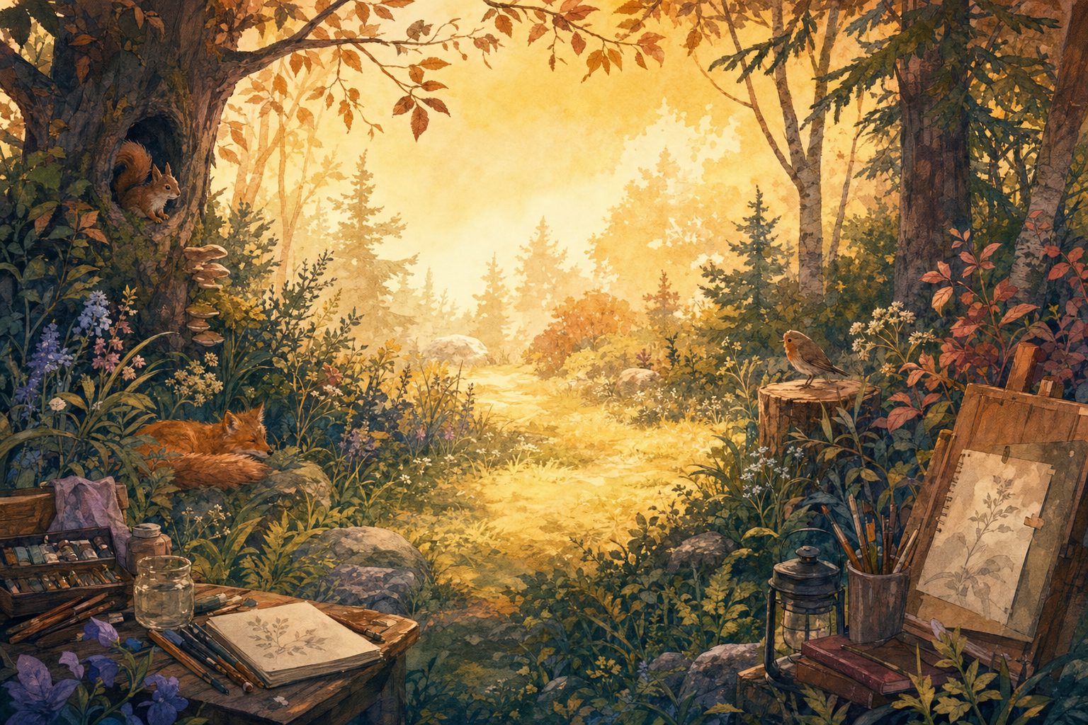
Here’s a test I run on almost every frame I make. I cover the character with my thumb, look at the background on its own, and ask where my eye goes. If it settles somewhere interesting that isn’t where the character stands, the background is fighting the shot, no matter how good the painting is.
Backgrounds are often the part of animation students fall for first, and I get why. A painted forest or a moody 3D set can be the most beautiful thing in a frame. But in a film the background has one job: give the character a place to perform and make that performance easy to read. I think of it as a stage. A stage can be gorgeous, but it’s built around the empty space where the actor stands.
The habit that changed my backgrounds most is simple. I never design one without the character blocked in. Blocking means roughing in where the character stands and how they move through the shot, before any detail exists. A gray silhouette (a filled-in shape with no interior detail) is plenty. When I thumbnail a shot, meaning I make small, fast sketches a couple of inches wide, the character goes in first and the environment grows around them.
This is where background design and staging meet. If you’ve drawn storyboards, you already know the question: what does the audience need to see in this moment? The background answers it with shape, value and color. You can see how I rough out staging in my storyboarding gallery, where most panels are about placement long before they’re about rendering.
Value is how light or dark something is, separate from its hue. It’s the strongest tool you have for steering the eye, because people read contrast before they read anything else. My rule of thumb is that the highest contrast in the frame belongs to the character, or sits right next to them.
In practice that usually means the background lives in a narrower value range than the character. If the character is dark against a pale wall, I keep the wall’s shadows from getting as dark as the character. If the character is lit and the set is in shadow, I keep the brightest spots in the set dimmer than the character’s face. One hot highlight in a corner, a lit window or a shiny pot, will pull the eye there first, and the viewer has to hunt their way back.
Color can hide value problems, so I check every frame in grayscale. In Photoshop that’s a black-and-white adjustment layer on top of everything, and in Procreate a layer filled with black and set to the Color blend mode does the same job. In Nuke it’s a saturation node set to zero. If the character doesn’t separate from the background in gray, color won’t rescue it. I’d much rather find that out at the thumbnail stage than after a week of painting.
Detail pulls attention almost as hard as contrast does. So I let detail thin out where the action happens. The edges of the frame can carry the texture: leaves, cracks, clutter on a shelf. Closer to the character, the shapes get bigger and simpler, the edges get softer, and the texture calms down. What’s left reads as a quiet pool the character can stand in.
That took me a while to accept, because painting detail is the fun part. I grew up working in paint and illustration, and my instinct was to finish every corner. Animation changed my mind. A finished corner is only worth the hours if it helps the story.
Watch for tangents while you’re simplifying. A tangent is a spot where a background line just touches the character’s outline, like a table edge lining up with a shoulder or a branch ending exactly at the top of a head. Tangents flatten depth and muddy the silhouette. Move the line, or overlap it clearly.
Color temperature is whether a color leans warm (toward red, orange and yellow) or cool (toward blue and green). Warm colors tend to feel closer and cool ones tend to recede. I often push the background cooler and a little less saturated, and save the warmest, most intense color for the character or the light falling on them.
It doesn’t have to go that direction. A cool character in a warm, glowing room can work just as well if the story wants it. What matters to me is that the character and the set don’t share the same temperature and saturation, because then they melt together no matter how carefully the values are planned.
The eye path is the route a viewer’s eye takes through a frame. A still illustration can afford a winding one, because people linger. A shot in a film might be on screen for a couple of seconds, and in that time the viewer has to find the character, read the expression and follow the action. So I keep the path short.
Leading lines help: a road, a branch, the edge of a shadow, anything that points toward the character instead of off the side of the frame. Framing shapes help too, like a doorway or an arch of trees that wraps around the action. And remember the character moves. I check the path at the start, middle and end of the action, not just against the one key pose I painted to.
Everything above carries over to 3D sets. Only the controls change. In Maya I build the environment with plain gray materials first and block the character in before any texturing happens. Value becomes a lighting question, so I place lights to make the character’s face the brightest, clearest thing in frame and let the set fall off around them.
Textures from Substance Painter can drift busy without anyone noticing until render time. I keep high-frequency textures (fine, dense patterns like gravel, bark or brick) away from where the character performs, or let depth of field soften them. In Nuke I can pull background values down, cool them off, or add a little atmospheric haze to push the set back. Then I run the same grayscale check.
For 2D, whether I’m in Toon Boom Harmony or Procreate Dreams, I paint backgrounds on separate layers by depth, so I can adjust the value and temperature of each plane without repainting. My painted work lives in my 2D character and illustration gallery if you want to look through it with this checklist in mind.
A background that wins attention away from the performance has failed at its job, even if it would be the strongest piece in a portfolio on its own. I don’t say that to knock background painting. It’s one of my favorite parts of the pipeline. It’s just that in a film the painting serves the moment, and the moment belongs to the character.
My own test for success: during the shot, nobody comments on the background. Pause the film, and everyone does.
So next time you paint one, block the character in first and check it in gray before you add a single leaf. If you’d like to see how I put this into practice on screen, my films are all on one page.

Emily Sarah Leeds is a writer and creative enthusiast at Emily Art, where she shares insights on art, creativity, design, and artistic expression. With a passion for exploring visual storytelling and creative techniques, Emily creates informative content that helps readers discover inspiration, develop their artistic skills, and stay connected with the evolving world of art.